Lectures for Information Visualization
Week 1 - Introduction
Week 2 - Human Visual Perception
Week 3 - Tufte + Human Computer Interaction
Week 4 - InfoVis Principles & Classics
Week 5 - Data Visualization
Week 6 - Interactive Infographics
Week 7 - Map & Geographic Visualization
Week 8 - Image & Gigapixel Visualization + Augmented Reality Visualization
Week 9 - Emerging Themes & State of the Art Visualization
Week 10 - Search Visualization
Week 11 - Text Visualization
Week 12 - Heuristic Evaluation of InfoVis Tool
Week 13 - Blog and Social Media & Network Visualization
Week 14 - Information Visualization Review
Week 15 - Term Project Presentations
View Page with Tabs | View Page without Tabs
Week 1 - Introduction
Lectures
Topics:
- Intro (7:22) Course Website.
- Course Overview (7:56) Course Goals & Approach, Gameplan, Term Project.
- Your Guide (2:18) and Your Guide 2 (5:14) InfoVis relevant content.
- InfoVis - Intro (14:54) Goals and Key Design Principles of InfoVis, Abstract vs. Spatial Data, Examples.
Files
Download: Handout
Resources
|
Ben Shneiderman talking about his research and Information Visualization |
Books
|
Readings
- NYTimes: The Future Of Work - It’s Data, Baby
- InfoVis Blogs: Flowing Data | Visual Complexity | Perceptual Edge | Storytellingwithdata
Week 2 - Human Visual Perception
Lectures
Topics:
- Intro (1:50)
- Visual Perception - Part 1 (20:52) Stage of Visual Processing, Luminance vs. Color, Pre-Attentive Processing.
- Visual Perception - Part 2 (22:49) Gestalt Laws, Motion Perception, Space Perception.
- Visual Perception - Part 3 (10:34) Depth Cues, Recap, Important for InfoVis Design.
- Visual Perception - Recap (4:09) Recap of Key Facts & Principles.
Files
Download: Handout
Readings
Readings:
- Data Journalism Handbook v2 - Online Version
- Specific chapters to read see Short Paper 1
Resources
|
|
iPod Ads: Shape-from-Contour & Cause/Effect | add Shape-from-Shading | soften Contrast Effects | complete ad campaign |
Week 3 - Tufte + Human Computer Interaction
Lectures
Topics:
- Intro (1:40)
- Tufte - Part 1 (18:07) Minard, Escape Flatland, Tufte's Measures.
- Tufte - Part 2 (7:30) Graph & Chart Tips, Hierarchy of Visual Features, Tufte's Principles.
- HCI - Part 1 (34:50) Key Concepts, LUCID, Diversity, Interaction Styles.
- HCI - Part 2 (20:33) User-Centered Design, Nielen's 10 Heuristics.
Files
Download: Handout
Readings
Readings:
- Data Journalism Handbook v2 - Online Version
- Specific chapters to read see Short Paper 1
Resources
|
Tufte would call CNN graphics chart-junk | Minard's Graph recreated in Excel with BeGraphic Add-in |
Week 4 - InfoVis Principles & Classics
Lectures
Topics:
- Intro (3:20)
- InfoVis - Part 1 (18:20) Origins, Key Design Principles, Toolbox.
- InfoVis - Part 2 (15:04) Design & Interaction, Stacked Scatterplots, SeeSoft, FilmFinder, Starfields, PerspectiveWall.
- InfoVis - Part 3 (18:49) Hierarchical Data, ConeTree, Treemaps, Recap.
- InfoVis - Part 4 (12:34) Focus+Context, Fisheye, TableLens, HyperbolicTree, Interaction Benefits.
- InfoVisClassics (20:39) Demos of FilmFinder, Starfields, PerspectiveWall, ConeTree, TableLens, HyperbolicTree.
Files
Download: Handout
Readings
Readings:
- Using Vision To Think: Information Visualization (pp. 1 - 33 or available in eCollege)
- Value of Information Visualization by J.-D. Fekete et al. (pp. 1- 18 or available in eCollege)
- A Tour through the Visualization Zoo by Jeffrey Heer et al.
- Storytelling: The Next Step for Visualization by R. Kosara & J. Mackinlay.
Resources
- History: Milestones of DataVis
- Taxonomy of Visualization Types: Periodic Table of Visualization
- Treemaps: Site | History | Demo | Video
- Examples: SmartMoney | Newsmap | Hivegroup
- Compare: 2011 Budget Proposal vs. 2013 Budget Proposal hierarchical visualizations created by NYTimes
- Focus+Context: Non-linear Magnification | FisheyeMenu | Walrus
Week 5 - Data Visualization
Lectures
Topics:
- Intro (5:35) | Intro Update (2:30)
- Demo and Common Display Types (3:45) Demo of Baby Names Voyager, Common Display Types.
- Visual DataStory Principles (18:58)
- Vis 1 = Motion Chart using Tableau - Due Week 6
- Vis 1 - Gapminder / Google Motion Chart (15:35) Useful intro but not using Google's Motion Chart in Vis 1
- How to Prepare Data for Motion Chart (9:52)
- Creating Motion Chart using Tableau (15:12)
- Tableau Tutorials
- Vis 1 Requirements
- Vis 2 = Dashboard Design using Tableau - Due Week 9
- Vis 2 Overview (4:05)
- Vis 2 Requirements
- Tableau Tutorials
Files
Download: Handout
Readings
Readings:
- The Joy of Stats: one-hour documentary broadcast by BBC with Hans Rosling explaining key statistical concepts and some of the ways how data is being visualized.
- Crime Spotting: open data and map visualization.
- Florence Nightingale: statistical visualizations.
- Averages
- Correlation
Resources
- Tools: Baby Name Voyager | Google Chart Tools | Visual.ly | Protovis | KDMC - DataVis | DataWrapper | Plotly
- Data Display Types: Selection Matrix | Visual Pattern Recognition
- Gapminder / Motion Chart
- D3.js (Data-Driven Documents)
- Tableau (Business Intelligence Software)
- Public Data Sets
|
200 Countries, 200 Years, 4 Minutes | TED: Debunking Third-World Myths |
- D3.js - Data-Driven Documents
|
D3.js is a JavaScript library for manipulating documents based on data. D3 helps you bring data to life using HTML, SVG and CSS. D3’s emphasis on web standards gives you the full capabilities of modern browsers without tying yourself to a proprietary framework, combining powerful visualization components and a data-driven approach to DOM manipulation. |
|
- Tableau - Business Intelligence Software
|
|
Week 6 - Interactive Infographics
Lectures
Topics:
- Intro (1:44)
- Infographics & NYTimes (18:34) Infographis vs. InfoVis, Isotype, NYTimes Visualizations.
Files
Download: Handout
Readings
Readings:
Resources
|
Week 7 - Map & Geographic Visualization
Lectures
Topics:
- Intro (1:30)
- Map & Geo Visualization: Part 1 (16:02) | Part 2 (12:30) | Part 3 (8:40)
- Previous: Map & Geo Visualization (5:34) Definitions, Examples, where2.0 Conference, Tools.
Files
Download: Handout
Readings
Readings:
Resources
- Resources: Cartography | Cartogram | GeoVisualization |
- Examples:Crimespotting SF | MapAction | Leaflet.JS | Google Earth | ArcGIS Explorer | Carto |
- NYTimes US Election Visualization: 2016 | 2014 | 2012 | 2008
- Demographics Census 2010 Explorer
|
|
|
Week 8 - Image & Gigapixel Visualization + Augmented Reality Visualization
Lectures
Topics:
- Intro (2:02)
- Giga - Intro (3:43) | Gigapixel Visualization (18:34)
- AR - Intro (2:22) | Augmented Reality (9:44)
Files
Download: Handout
Resources
- Wikipedia: Gigapixel | Zoomable Interfaces | Map Projections
- whereRU: Virtual Experience of Rutgers (using Gigapans and Photosynths)
- Other Examples & Tools:
- 360Cities: London
- Krpano
- Autopano (and now Kolor)
- Gigapan
- Photosynth
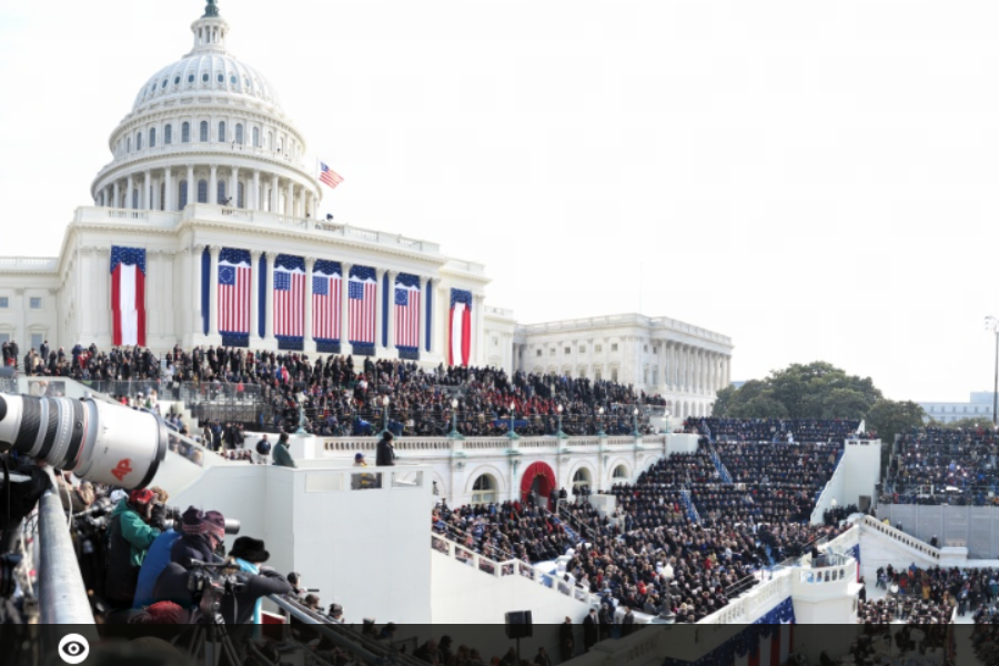 President Barack Obama's Inaugural Address by David Bergman |
|
- Wikipedia: Augmented Reality
- Tools
- Meta | Microsoft HoloLens | Apple AR on iPhone 8
- Total Immersion: TryLive Video
- Wikitude: Showcases | Early Video: Wikitude AR Travel Guide
- Layar: Intro Video | Video: Mobile Reality Browser |
- Research: Georgia Tech | USC
- Augmented Music Video: Mashable Story: John Mayer
- Google Glass | Enterprise Edition
|
|
|
|
|
Google Glass is back for Round Two |
Week 9 - Emerging Themes | State of the Art Visualization
Lectures
Topics:
Files
Download: Handout
Resources
- Big Picture Group - Google Brain:
- TensorFlow | Get Started | Effective TensorFlow for Non-Experts
- Embedding Projector : visualization tool for high-dimensional data
- Principal Component Analysis: statistical procedure that uses orthogonal transformation to convert a set of observations of possibly correlated variables into a set of values of linearly uncorrelated variables called principal components.
- t-SNE: machine learning algorithm for dimensionality reduction
- Visualizing High-Dimensional Space (video)
- StatQuest: t-SNE, Clearly Explained (video)
- How to Use t-SNE Effectively (visual explanation)
- Demo (7:57)
- Data: vectors | meta-data
- Co-Occurrence Matrix Visualization of Network Structure of Editors of Most Controversial Pages in Wikipedia
(research project by Anselm Spoerri and collaborators) - TensorFlow Playground : transparent neural net you can play with in your browser
- Understanding Artificial Intelligence Data Visualization
- Graph Visualization
- Visualizing Dataflow Graphs of Deep Learning Models in TensorFlow (Best Paper InfoVis 2017)
- Facets : visualizations for machine learning datasets
- Understanding your data is critical to building a powerful machine learning system.
- Fairness in Machine Learning : understand issues around fairness and machine learning.
- Machine Translation : visualizing hints that a translation network learns an “interlingua”, or universal language.
- Distill -Machine Learning Research Should Be Clear, Dynamic and Vivid.
- Attention and Augmented Recurrent Neural Networks
- How to Use t-SNE Effectively
- Experiments in Handwriting with a Neural Network
- Cracking open black box of deep learning | Visualizing High-Dimensional Space
|
|
Week 10 - Search Visualization
Lectures
Topics:
- Intro (2:05)
- Search Visualization (29:36)
Files
Download: Handout
Readings
Resources
- Visual Search Tools: Carrot2 | Aduna / Vound
- InfoCrystal - MetaCrystal - searchCrystal:
- searchCrystal: Papers
- Wikipedia Visualization: Demo: Most Popular | Screencast: Edit Wars | Demo: Edit Wars
- MetaCrystal: Papers | Related Research
- InfoCrystal: Site | Papers | PhD Thesis
Week 11 - Text Visualization
Lectures
Topics:
- Intro (0:30)
- Text Visualization (12:40)
Files
Download: Handout
Readings
Resources
- Some Tools: Wordle | TextArc | Novel Views: Les Miserables | Tolkien's works
Useful too to explore different approaches: Visual Survey of Text Visualization Techniques
Week 12 - Heuristic Evaluation of InfoVis Tool
Week 13 - Blog and Social Media & Network Visualization
Lectures
Topics:
- Intro (0:52)
- Social Media Visualization (17:12)
Resources
- Social Media: Wikipedia
- Micro-blogging - Twitter: TrendsMap | Revisit | Twitter Social Network Analysis | Thruthy |
SocialFlow: Breaking Bin Laden - Social Networking - Facebook: Facebook Visualizations | Palantir Video | Happiness Index |
- Social Bookmarking - Delicious: Delicious Soup |
- Blogs: WeFeelFine | TheDumpster | Mapping The Blogosphere | Mapping the Political Blogosphere |
- Wiki - Wikipedia: HistoryFlow | Visualize Overlap |
- Music - Last.fm: LastGraph | StreamGraph |
- Photos - Flickr: TagGalaxy | MIT Sensable City Videos | GeoTagger's World Atlas Local vs Tourist |
- Social Networks: Wikipedia
- Valdis Krebs: General | Co-Authorship | Hijackers | Uncloaking Terrorist Networks |
- AT&T Visualization Team: GraphVis
- Touchgraph: Site | Facebook | Google Browser |
- Gephi: Site | Learn
- Useful Resources: VisualComplexity | FlowingData | More Links |
Week 14 - Information Visualization Review
Lectures
Topics:
- Exploring Data Visualization Approaches to Enhance Student Engagement (103:00)
ACRL/Choice Webinar by Prof. Spoerri that presents key design principles for creating effective data visualizations.
Week 15 - Term Project Presentations
Lectures
Topics:
- Virtual Project Presentations.