3 InfoCrystal ................ 33
- 3.1 Introduction ................ 33
- 3.2 2D versus 3D Visualization ................ 33
- 3.3 Visualizing Relationships ................ 34
- 3.4 Rank Layout Algorithm ................37
- 3.5 Example Revisited ................49
- 3.6 The Design Process of the InfoCrystal ................ 51
- 3.6.1 The First Designs for the InfoCrystal ................ 51
- 3.6.2 InfoCrystal Networks ................ 53
- 3.6.3 Combining the InfoCrystal with Venn Diagrams ................ 54
The postscript version of this chapter.
Chapter 3
InfoCrystal
3.1 Introduction
How can we visualize how the contents of a large and abstract information space are related to multiple interests specified by the user ? We begin to answer this question by first addressing the question of how to visualize all the possible relationships among N concepts. Towards that end we will develop the discrete version of the InfoCrystal. The goal of this chapter is to demonstrate how the InfoCrystal can be used as a visualization tool that shows how the contents of an information space are related to a set of specified concepts. In particular, we will revisit the example presented in the introduction to show this. Second, we will demonstrate in the next chapter how the InfoCrystal can be used to formulate Boolean queries graphically. We will also show how the InfoCrystals can be used as building blocks and integrated in a hierarchical structure to formulate arbitrarily complex queries. Third, we will show in a subsequent chapter how users can assign relevance weights to the concepts and set a threshold to select relationships of interest. This enables users to formulate weighted Boolean queries. Fourth, we will describe the rank layout and the bull's-eye layout principle that visualize an InfoCrystal so that the relationship with the highest rank or the one with the largest relevance score will lie in its center, respectively. Finally, in a subsequent chapter we will show how the InfoCrystal can be generalized to visualize Partial Matching retrieval methods. Hence, we will demonstrate that the InfoCrystal can be used both as a visualization tool and visual query language.
3.2 2D versus 3D Visualization
Before addressing the question of how to visualize relationships, we want to briefly motivate our deliberate decision to use "only" a two-dimensional display to solve the problem statements of this thesis. Three-dimensional displays are visually very appealing and they have the power to dazzle users. This is certainly one of the reasons that there is currently a great rush to enhance information displays with 3D computer graphics, especially as the cost for the needed computer power and speed continues to decrease. In the case of scientific visualization, where the data commonly has its origin in a three-dimensional physical space, this choice makes a great deal of sense. However, in the case of abstract information spaces the use of 3-D requires a more careful justification.
Three-dimensional displays are ideally suited for representing information spaces that satisfy the same constraints that govern the physical world for which our visual system has been optimized. As stated previously, the visible physical world consists mostly of smooth surfaces, whose visual properties change smoothly across them, except at object boundaries. The human visual system uses two-dimensional projections to reconstruct the three-dimensional world. It follows that there will be information that is not visible from a given point of view. Hence, three-dimensional displays require users to shift their point of view to see the information that is currently occluded, causing other information to become occluded. The human visual system uses the way things come into or go out of view at object boundaries to make inferences about the visual world [Spoerri 1991].
Many abstract information spaces do not satisfy the smoothness constraint. They present a special challenge for information visualization because they will cause visual discontinuities that are spurious, especially when we have to shift our point of view in a three-dimensional display. Hence, we choose for now to use a two-dimensional display to limit the creation of misleading visual discontinuities. Further, we want to investigate how much information can be "squeezed out" of a two-dimensional display. Once this has been firmly established, we want to investigate how we can add the third dimension to support the visualization in an appropriate way.
3.3 Visualizing Relationships
How can all the possible combinations or relationships among several search criteria be visualized in a two-dimensional display ? A common approach is to use Venn diagrams to visualize set relationships by intersecting geometric shapes that represent each set. There is a common misconception that it is not possible to generate such Venn diagrams that can represent all the possible relationships for any number of sets. There exist constructive proofs that show how we can use convex, but not circular shapes to generate Venn diagrams that represent all the possible relationships between N concepts, but the visual areas corresponding to the different relationships become increasingly small and difficult to identify as the number of concepts increases [Humphries (1987), Anderson 1988)]. Hence, it is difficult to represent all the possible relationships among more than three concepts in a visually compact and simple way.
We will now demonstrate how we can move beyond the Venn diagram approach so that all the possible relationships among N variables can be represented in an elegant way. Figure 3.1 shows how a Venn diagram of three intersecting circles can be transformed into an iconic display. We start out by exploding the Venn diagram into its disjoint subsets. Next, we represent the subsets by icons whose shapes reflect the number of criteria satisfied by their contents, also called the rank of a subset. Finally, we surround the subset icons by a border area that contains icons, also called criterion icons, that represent the original sets.
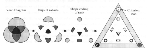
Figure 3.1: shows how we can transform a Venn diagram into an iconic display, called the InfoCrystal.
The goal is to arrive at a representation that lets users use their visual reasoning skills to establish how the interior icons are related to the criterion icons. The following visual coding principles are used in a redundant way:
- Shape Coding: is used to indicate the number of criteria that the contents associated with an interior icon satisfy (i.e., one -> circle, two -> rectangle, three -> triangle, four -> square, and so on).
- Proximity or Location Coding: The closer an icon is located to a criterion icon, the more likely it is that the icon's contents are related to it.
· Rank Coding: Icons with the same shape are grouped in "invisible" concentric circles, where the rank of an icon is equal to the number of criteria satisfied and the rank increases as we move towards the center of an InfoCrystal.
· Color or Texture Coding: is used to indicate which particular criteria are satisfied by the icon's contents.
· Orientation Coding: The icons are positioned so that their sides face the criteria that they satisfy.
· Size Coding: is used to visualize quantitative information, i.e., the number of elements represented by an icon.
There is also the possibility to use brightness and saturation to represent quantitative information. We have not considered these two perceptual dimensions in the current implementation of the InfoCrystal, but we plan to do so in the future.
Figures 3.2 to 3.10 show InfoCrystals that consist of three, four, five, six, seven, eight, nine and thirteen search criteria, respectively. The reader should keep in mind that we are limited in this text document to use black and white textures to indicate the different criteria, whereas the use of color does greatly facilitate the ready interpretation of the InfoCrystal with more than four criteria. As these figures show, the number of possible combinations or relationships among N different criteria grows exponentially and it is equal to 2N. We visualize 2N - 1 of these possible relationships and we choose not visualize the relationship that specifies documents that satisfy none of the criteria. One of the objectives of the InfoCrystal is to enable users to explore an information space along several dimensions simultaneously; or to use another metaphor, we want users to be able to juggle multiple concepts without becoming too overwhelmed by the resulting complexity.
The user can choose to visualize the interior icons so as to emphasize the qualitative
or the quantitative information associated with them. If users are
interested in how the interior icons are related to the criterion icon, then
they can display them in a variety of different styles, as shown in Figures 3.2
to 3.10: 1) as polygons with colored or textured borders, where they can make
use of the location, shape, color/texture and orientation coding cues to infer
the icon's precise relationship to the criterion icons; 2) as simple polygon
outlines, where users receive location, shape and orientation coding cues;
3) as small circular place holders, where they only receive location coding
cues. If, however, users want to visualize quantitative information, i.e., the
number of documents associated with the interior icons, then the icons can be
represented as simple numbers or as circular pie-chart icons whose sizes
reflect the numerical information (see Figures 3.3, 3.11, 7.3 to 7.12, 7.14,
12.2). The pie-chart icons are similarly oriented as the polygon icons and the
colors or textures of their slices indicate which criteria are satisfied.
3.4 Rank Layout Algorithm
We have developed a layout algorithm that enables us to generate InfoCrystals with N inputs. The objective of this algorithm is to create a layout of the interior icons, where none of their locations coincide. We call it the rank layout principle, because it strictly enforces the rank coding principle: the number of criteria satisfied by an interior icon increases as we move towards the center of the InfoCrystal; and users can expect to find the icon with the highest rank in the very center.
The computation of the rank layout involves the following steps, although there are exceptions that we will address below: First, we specify N circular bands of equal width within which the icons with the same rank have to be placed. Second, we compute a center of gravity for each icon as follows: we define a two-dimensional vector pointing from the center of the InfoCrystal to each criterion icon that is satisfied by an interior icon. We take these vectors to compute their center of gravity, which is equal to the averaged sum of all the vectors. Third, we compute for all icons with the same rank the distance of their center of gravity from the InfoCrystal's center. Next we determine how many distinct distance values there are for the icons with the same rank and we subdivide their corresponding circular band accordingly to define a series of circles lying within in this band. Each icon is assigned a circle on which it needs to be placed. Fourth, we define a straight line that passes through the center of gravity of an icon and the InfoCrystal's center. We will place the icon where this line intersects the circle on which the interior icon has to lie. Finally, we orient the icon in such a way to minimize the angle between the normal to the side that corresponds to a particular criterion that is satisfied and the vector that points from the icon's location to that criterion.
There are exceptions to this general algorithm that occur predominantly when we have an even number of inputs to an InfoCrystal. First, degenerate cases occur when the center of gravity of an interior icon coincides with the center of the InfoCrystal. Hence, we can not compute the distance and specify the straight line. For each interior icon polygon, we can define a figure whose corners correspond to the criterion that are satisfied by the icon in question. The degenerate case occurs when this figure is symmetrical. We solve this problem by differentiating between the cases where the number of criteria satisfied, i.e., the rank, is either odd or even. If the rank is odd, then we place a duplicate in each direction that points towards a criterion icon that the interior icon satisfies. If the rank is even then we compute the major axis of symmetry and we place a duplicate where this axis intersects the circle on which the icon has to lie. In addition, if the rank is a multiple of four, then we place duplicates where both the major and minor axes intersect the circle (see Figure 3.7).
Second, in the case of an interior icon of rank two that involves non-adjacent criterion icons, the algorithm outlined above would place the interior icon closer to a criterion icon not related to it than to the criterion icons that it is actually related to (see Figure 3.5). Instead, we choose to duplicate these icons of rank two, so that they are as close as possible to their related criterion icons as well as at the correct distance from the center. Their locations are computed by intersecting the circle on which these duplicate icons of rank two have to lie with the straight line that connects the two non-adjacent criterion icons.
Third, we distinguish between the following cases if we have an even number of criteria. We begin by testing if the figure defined by the criterion icons that are satisfied, called positive criterion icons, possesses an even or odd axis of symmetry. An even symmetry implies that the axis passes through a midpoint between two consecutive positive criterion icons. An odd axis of symmetry implies that the axis passes through one of the criterion icons. We place the interior icon where the axis of symmetry intersects the circle on which the interior icon has to lie and we choose the intersection point that is closer to the center of gravity. If no axis of even or odd symmetry exists, then we parse the ordered list of positive criteria into segments of consecutive numbers. We then calculate the gap between these segments to identify the one that has the largest gaps on either side, which we call the most isolated segment. We calculate the center of gravity for the most isolated segment and test if it coincides with the center of gravity of the positive criterion icons. If they do not coincide, then we can use these two points to define line and we choose the intersection point with the circle on which the interior icon has to lie that is closer to the center of gravity.
We do not claim to have found an absolute solution that will never cause the icons to be mapped to identical locations as the number of input criteria increases. We have focused our energies to devise at a layout algorithm that will place the interior icons in different locations, except for very few exceptions (see Figure 3.8), when we have not more than ten concepts that we want to juggle at the same time.
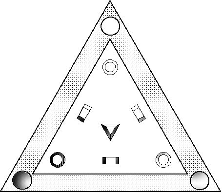
Figure 3.2: shows the InfoCrystal that visualizes the possible relationships among three search criteria. This figure can serve to illustrate a visual strategy that users can use to read a crystal: they can think of a border or criterion icon as a colored light source, and only the icons that are related to that criterion have a side facing it and hence are able to reflect back its colored light.
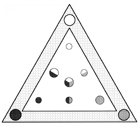
Figure 3.3: shows an InfoCrystal that visualizes the quantitative information associated with the interior icons, using the pie-chart style that employs size coding to reflect the quantitative information and the texture or color of the pie slices indicate which criteria are satisfied.
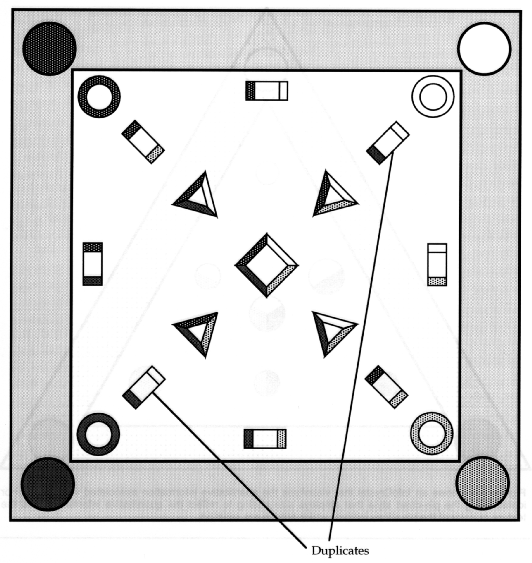
Figure 3.4: displays an InfoCrystal that involves four criteria. This crystal is the first one where we choose to duplicate certain icons, because there are icons whose center of gravity coincides with the center of the InfoCrystal. These degenerate cases occur for criterion icons that lie diagonally opposite each other. We resolve these degenerate cases by placing the interior icons so that they are close to their related criterion icons as well as at the correct distance from the center.
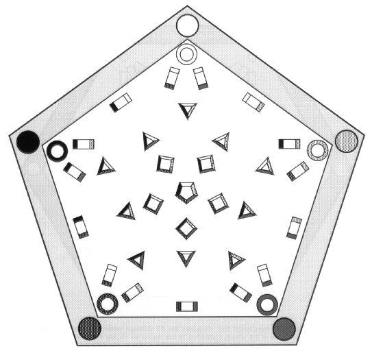
Figure 3.5: shows the InfoCrystal that visualizes all the relationships among five criteria. It is worth stressing again that the use of color would greatly facilitate the rapid interpretation of an InfoCrystal that "juggles" more than four criteria simultaneously.
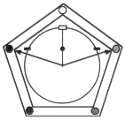
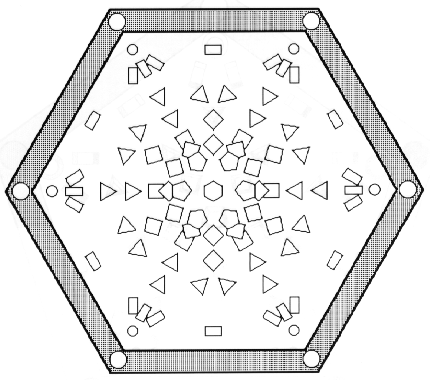
Figure 3.6: displays the InfoCrystal that visualizes the 63 different relationships among six search criteria, where at least one of the criteria is satisfied. In this crystal we display the icons only in the outline style, where users still can use location, shape and orientation coding to infer how the icons are related to the criterion icons.
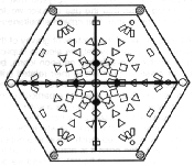
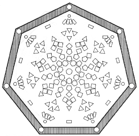
Figure 3.7: displays the InfoCrystal that visualizes the 127 different relationships among seven search criteria, where at least one of the criteria is satisfied. In this crystal we display the icons only in the outline style, where users still can use location, shape and orientation coding to infer how the icons are related to the criterion icons. Also for this InfoCrystal we choose to duplicate icons of rank two that involve non-adjacent criterion icons so that they are as close as possible to their related criterion icons as well as at the correct distance from the center.
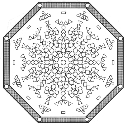
Figure 3.8: displays the InfoCrystal that visualizes the 255 different relationships among eight search criteria, where at least one of the criteria is satisfied. In this crystal we render the icons only in the outline style, where users still can use location, shape and orientation coding to infer how the icons are related to the criterion icons.
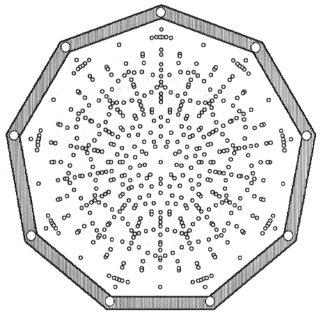
Figure 3.9: shows the InfoCrystal that displays all the 511 different relationships among nine search criteria, where at least one of the criteria is satisfied. In this crystal we visualize the icons only in the point style, where users can only use location coding to infer how the icons are related to the criterion icons.
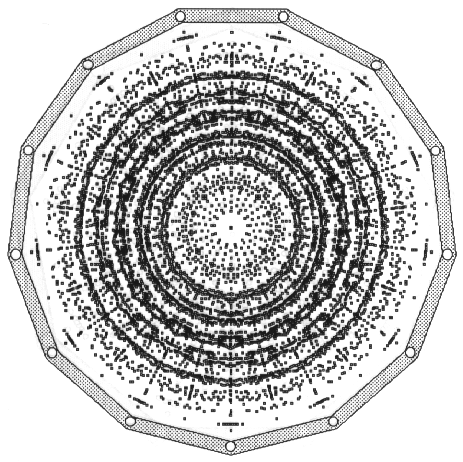
Figure 3.10: shows the InfoCrystal that displays all the 8191 different relationships among thirteen search criteria, where at least one of the criteria is satisfied. In this crystal we visualize the icons only in the point style, where users can only use location coding to infer how the icons are related to the criterion icons. The purpose of this figure is to demonstrate how the developed rank layout algorithm is able to generate an InfoCrystal of that complexity. Although the number of concepts results in a complexity of relationships that is staggering and overwhelming, we can imagine, for example, marketing applications where we could use brightness and/or saturation coding to give users a rough sense of how the contents of a database distribute across the space of relationships of so many criteria.
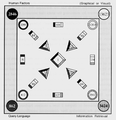
Figure 3.11: The number associated with an icon indicates how many of the retrieved documents satisfy the relationships represented by it. A total of 19,691 documents was retrieved from the INSPEC Database (1991-92) that satisfy any of the four search criteria, but there is only one document that satisfies all the four criteria ! One of the advantages of the InfoCrystal is that it visualizes how the contents of a database distribute across the different possible relationships and thereby not locking users into just one way of viewing the data.
3.5 Example Revisited
We will now revisit the example presented in the section 1.5 to show how the InfoCrystal enables users to see in a single display how the database contents are related to the interests specified by the users. This type of visual feedback could help them to formulate a query that does not retrieve either too few or too many documents. Figure 3.11 displays how the contents of the INSPEC Database (1991-92) relate to the four displayed interests. The center icon of the InfoCrystal represents the documents that satisfy all the four criteria. In our example there is just one document. We can easily broaden our focus of interest by examining the icons that surround the center icon and satisfy three of the four concepts. For example, there are 22 documents that are related to the (Graphical OR Visual), Information Retrieval, and Query Language concept but not to the Human Factors concept. If we want to move further away from our initial interest then we could explore the 6 documents that have been indexed under the Query Language and Human Factors concept but not under the (Graphical OR Visual) or Information Retrieval concept.
As the above discussion indicates, the InfoCrystal enables users to easily broaden or narrow their focus of interest. Users can represent their current interests by selecting the interior icons that capture it. The selected interior icons can be thought of as defining a "figure" and the not selected icons as representing the "ground". The InfoCrystal allows users to easily alter this figure-ground relationship. Hence, they are not locked into just one way of viewing the data, but they can explore an information space in a flexible and fluid way. The organization of the InfoCrystal ensures that users can easily infer how the retrieved documents relate to their interests.
We have discussed in chapter 2 how a modern Boolean query can be described along the following four dimensions: coordination, proximity, stemming, and field level. The number of retrieved documents can be changed by making the appropriate choices along these four dimensions. We have noted above that there is only one document that satisfies all four criteria in Figure 3.11. This could be changed by applying a stemming operation to the terms used to search the INSPEC database. Further, we could relax the proximity requirements for the search concepts that involve multiple words and we could search over all fields to obtain more documents that satisfy all four criteria. In chapter 4 we will show how changes along these four dimensions can be specified in a visual way.
3.6 The Design Process of the InfoCrystal
The transformation process depicted in Figure 3.1, where we show how the familiar circular Venn diagrams can be translated into the InfoCrystal, is visually very compelling and memorable. However, it is also misleading because it does not reflect the way we developed the InfoCrystal. If we had chosen the path of attack suggested by Figure 3.1, where we explode circular Venn diagrams, then we might have not been able to create a presentation that can visualize all the relationships among more than three entities. Figure 3.1 serves as a visually compelling bridge between the familiar circular Venn diagrams and the novel InfoCrystal representation. We will now present earlier sketches, beginning with the very first designs and ending with most recent ones before the final version of the InfoCrystal, to give a flavor of the design process of the InfoCrystal. This design history is instructive because it highlights some of the used visual coding principles and their effectiveness. Further, it shows alternative ways of visualizing the relationships among several entities.
3.6.1 The First Designs for the InfoCrystal
Rooted in our background in computational vision, we used the location and proximity grouping principle to guide us in the initial designs. We started out by placing a set of search interests on the computer screen. We then imagined that these interests would act like magnets that attract the relevant information, thereby leading to a compact overview of how the contents of a library were related to our specified interests. We wanted a representation that enabled us to focus on specific relationships without forcing us to abandon our sense of overview. Most of all, we want to be able to simultaneously "juggle" as many interests as possible: three balls at the same time - you must be joking ! - four, five, ... as many as we can barely keep up in the visual space. Figure 3.12 shows these initial designs.
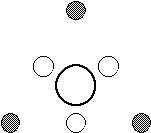
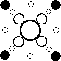
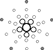
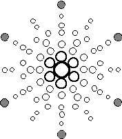
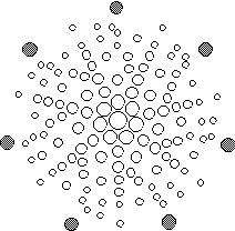
Figure 3.12: shows the first sketches of the InfoCrystal with up to seven inputs, where we used the location and proximity grouping principle as the key design and organizing principle.
3.6.2 InfoCrystal Networks
The next figures show how we built on the initial designs by introducing connecting lines as a further coding principle to visualize all the possible relationships among multiple entities. The filled circles perform a dual function: 1) they represent the reference entities; 2) they represent the relationships of rank one. The connecting lines make explicit how a circle is related to the reference entities. The rank of a circle is encoded by its size and to some degree by the number of lines emitting from it.
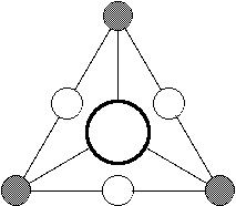
Figure 3.13: shows how the InfoCrystal with three inputs can be visualized as a network.
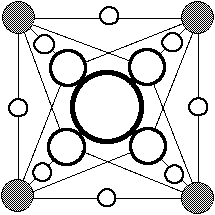
Figure 3.14: shows how the InfoCrystal with four inputs can be visualized as a network.
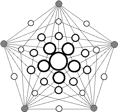
Figure 3.15: shows how the InfoCrystal with five inputs can be visualized as a network.
3.6.3 Combining the InfoCrystal with Venn Diagrams
Once the locations of the icons, which represent the different relationships, had been figured out, we started to add other visual grouping principles, such as shape, color and orientation, to facilitate the visual interpretation of the designs. The visual appearance of the interior icons in turn had such a strong "button" appearance that it led us to interpret the InfoCrystal as a keyboard. This opened up the door of using the InfoCrystal not only as visualization tool, but also as a visual query language, as we will show in the chapter 4.
Next, we considered using circular Venn diagrams as an additional visual organizing principle. We were wondering if there could be a way of visually enclosing all the interior icons that are related to a particular criterion icon. We started to draw bounding lines, and because we have preference for symmetrical and classical design we used circles. This reminded us of the Venn diagrams that we had encountered during our schooling. However, if we had used the Venn diagrams as our starting point, then we might have "hit a wall", once we would have tried to visualize the relationships among four entities. It is impossible to represent all the relationships among four sets if we want to use circles to represent the sets (see Figure 3.17). For example, Jock Mackinlay at Xerox PARC used circular Venn diagrams as his starting point and he ran into this exact problem of how to devise an arrangement for the cases that involve more than three intersecting sets (personal communication). There are also the interfaces by Michard (1982) and Hearst (1994) that use the Venn diagrams as their key visual metaphor, and they have not been able to move beyond three intersecting sets. We will now present designs that show how we could combine the rank layout of the InfoCrystal with Venn diagrams for the case of at most five intersecting sets (see Figures 3.16 to 3.18). However, we abandoned the circular Venn diagrams as an additional visual organizing principle because first of all it increased the visual clutter. Furthermore, the border segment of an interior icon that is closest to a circle does not have the same color as the circle (see Figures 3.16 to 3.18). Hence, the visual coding cues that users receives from a circle and the border segment of an interior icon in its vicinity are in conflict. This realization was the outcome of informal user studies, where we asked the subjects to color the borders of the interior based on the color of the reference icons and colored circles. The subjects initially used local visual cues to decide how to color a particular border area, but the circle segment closest to the interior icon would not represent the correct color. Hence, the subjects did have to adopt a more global perspective to determine the correct color, which they were able to do.
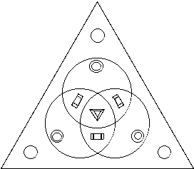
Figure 3.16: shows how the InfoCrystal with three inputs can be combined with the familiar circular Venn diagrams.
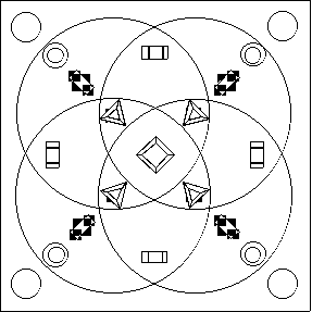
Figure 3.17: shows how the InfoCrystal with four inputs can be combined with the familiar circular Venn diagrams. The four intersecting circles do not create any areas that correspond exclusively to the relationships of rank two that involve non-adjacent criteria. Hence, we have to place these rectangular icons in the areas that "belong" to the icons of rank one.
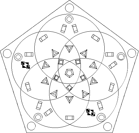
Figure 3.18: shows how the InfoCrystal with five inputs can be combined with the familiar circular Venn diagrams. However, the intersecting circles do not contain areas that correspond exclusively to the relationships of rank two that involve non-adjacent reference concepts, and areas that represent relationships of rank three where only two of the reference concepts are adjacent to each other.