10 Relevant Research ................ 169
- 10.1 Overview Maps ................ 169
- 10.2 Visualizing Hierarchical Structures ................ 176
- 10.3 Familiar Metaphors for Accessing Information ................ 179
- 10.4 Visual Query Languages ................ 181
The postscript version of this chapter.
Chapter 10
Relevant Research
In this chapter we will describe work by other researchers that is of direct relevance to this thesis. We will indicate how the work mentioned here complements or could be integrated with the InfoCrystal. We will also try to situate the InfoCrystal by comparing it directly with this relevant and previous work. In particular, we will focus on the shortcomings of the existing proposals, as we perceive them, and we will indicate how the InfoCrystal addresses them. We hope this type of exposition will better motivate the approach taken in this thesis as well as help to focus the discussion of what types of information tools will be effective. We will be considering the following approaches: overview maps, ways to visualize hierarchical structures, applications of familiar metaphors for accessing information and ways to display the content of documents, and visual query languages.
10.1 Overview Maps
Several researchers have suggested that some sense of the topography of an information or document space would be useful in the retrieval of information. The basic motivation for such an overview map is to enable users to (re)formulate their queries based on a better sense of the document space, to allow them to browse through the document collection and to enable users to use a map as the retrieval interface. We will now describe several of these overview maps that have been developed. The main difference between these approaches is not so much their visualization metaphor but the particular functions used to perform the mapping of higher-dimensional space into a 2D or 3D display:
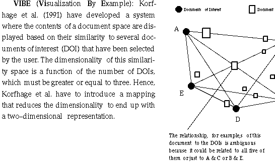
They model the similarity space between the user-defined documents of interest
(DOI) and the documents by using the ratios of their distances from the DOIs.
The resulting loss of information, however, leads to interpretation
difficulties because documents with different relationships to the DOIs can
superimpose on the same image point. Hence, the user cannot uniquely infer from
the display how a document is exactly related to the defined DOIs. The display
gives the user only an approximate sense of the relationships between the
contents of the document space and the DOIs. The authors claim that any
superposition of document points that is not due to equal distance ratios can
be resolved by manipulating the image, but the user must be sufficiently versed
in use of VIBE to understand this. In VIBE the position of a document depends
on the relative distances from the POIs. Hence, a document point can be located
close to a certain POI, and still contain relatively little information about
that POI. To show the absolute strength of the relationships, VIBE has to use
the size coding that is proportional to the strength of the most significant
POI. The VIBE suffers from the problem that the display points do not have a
unique and straightforward interpretation, because documents with different
relationships to the DOIs can superimpose on the same display point. Hence, the
VIBE display can be hard to interpret.
· The InfoCrystal shows how the contents of a document space relate to several points of interest, but with the following important difference: The InfoCrystal imposes a structure on how the relationships are visualized so that the display points have a unique and straightforward interpretation. This property is exploited to use the display as a visual interface to formulate Boolean as well as weighted queries. Furthermore, the InfoCrystal scales well because it can visualize categorical relationships instead of just individual documents, which will clutter the display as their number increases.
LyberTree and LyberSphere: Hemmje et al. (1994) have developed a 3D based visual interface that consists of the LyberTree and LyberSphere visualization modules. Hemmje et al. use the Cone Tree metaphor developed by Card et al. (1991) for visualizing the content spaces, and the VIBE representation to represent the results of a query (see 10.2 for a description of the Cone Tree metaphor). They extend the VIBE representation from a 2D circle to a 3D sphere, where the retrieved documents are mapped onto the sphere in accordance to their relevance to a query. Further, they transform document term networks with two levels of abstraction into hierarchical and directed Cone Trees that use spatial depth to achieve the perception of their topological structure. If the currently selected item is a document, then its new subtree will consist of all its specific terms. This set of terms is automatically generated by a probabilistic information retrieval system. If the selected item is a term, then its new subtree will contain all the documents in which the term is contained. Hemmje et al. hope that users will easily recognize that they have visited certain areas before, because the geometry of the LyberTree looks the same or because the topology requires the same, repeated navigational decisions from the user.
· We have outlined how the InfoCrystal differs from the VIBE approach of visualizing an information space. Hence, the same comments apply for LyberSpheres.
Next we will discuss several methods that use clustering approaches to devise a 2D or 3D representation of a large information space. We will discuss at the end of this section how these clustering approaches are related to the InfoCrystal:
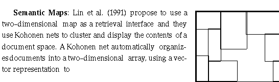
drive the net; and it then labels the documents with the most frequent keyword.
The resulting map is divided into concept or cluster areas, which is supposed
to reveal the frequencies and distributions of the underlying data. When
mapping higher-dimensional information into a lower-dimensional space, a loss
of information and some distortion is unavoidable. The authors claim that
document interrelationships are faithfully maintained by the Kohonen net
transformation. This map is intended as a browsing tool to support ordering,
linking and browsing information gathered by more traditional filters. The
authors suggest that such a map representation could make it easier to identify
relevant documents from a large retrieved set and therefore make low
precision/high recall results more acceptable. It is, however, not clear how
well this approach will work with large data collections.
On the basis of on the index, weighted keyword vectors of all documents are
computed. A simple clustering technique is used to partition the document space
into non-overlapping "hyperdrawers", using a centroid based
technique. Initially each document is put in a separate hyperdrawer. Nodes are
then added sequentially to the drawers one at the time. The document d is added
to the hyperdrawer h that has the highest similarity value.
Interactive Clustering: Faieta and Lumer (1994) have developed a statistical clustering algorithm that is based on collective processing and self-organization. It supports the dynamic visualization and direct manipulation of emergent structures present in multi-dimensional data sets. It uses a standard two-dimensional grid to display its results. The algorithm first places database elements randomly in a grid and then aggregates them in a particular way so that statistical regularities are mapped into spatially structured clusters. The grid is displayed so that users can probe and alter the characteristics of the clusters as they formed. Their clustering algorithm differs from others in that users have the opportunity to intervene at various points of the clustering process. It is the users who decide what they consider is a cluster based on what they see forming on the screen. Commonly, multi-dimensional scaling methods try to conserve distances between points so that points close together in n-dimensional space are mapped close together in the lower dimensional space. Their algorithm, however, relaxes this requirement to end up with a faster algorithm for visualizing the clustering process.
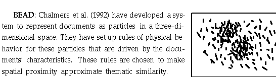
By using physically based modeling techniques to take advantage of fast methods
for approximating potential fields, they represent the relationships between
documents by their relative distance. Inter-particle forces tend to make
similar articles move closer to one another and dissimilar ones move apart,
resulting in a 3D space that can be used to visualize patterns of a
high-dimensional document space. The user can explore this space either by
inspecting the three orthogonal plots (in XY, XZ and YZ) or watching an
animated perspective view as seen from the point of view rotating around the
center of mass. If a query is issued then each particle is given a color
according to its document distance from the query. The user can zoom in on an
appropriately colored particle in order to see how neighboring particles are
related to each other. As mentioned before, the lower dimensionality of the
space into which the document space is mapped into, the greater the loss of
information and the more approximate the representation of document relationships.
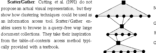
Initially their system scatters the document space into a small number of
document groups, or clusters, and presents short summaries of them to the user.
On the basis of on these summaries, the user selects one or more of the groups
to form a subcollection. The system then applies clustering again to scatter
the new subcollection into a small number of document groups, which are again
presented to the user. With each successive iteration the groups become
smaller, and therefore more detailed. Their technique is directed towards
information access with non-specific goals and is intended as a complement to
more focused methods. Their technique is meant to be used by users who have
non-specific goals or who have difficulty formulating their queries because
they are not sure which terms are appropriate. This technique could also be
helpful in situations in which is difficult or undesirable to specify a query
formally. The system currently does not communicate with the user through a
visual interface, but instead uses a command-line interface and prints the
results as a textual list.
The work by Cutting et al. (1991) is promising because it has better
performance characteristics than other clustering methods. It could be used to
let users specify relevant reference documents that could be used to define the
inputs of the InfoCrystal (see Chapter 12).
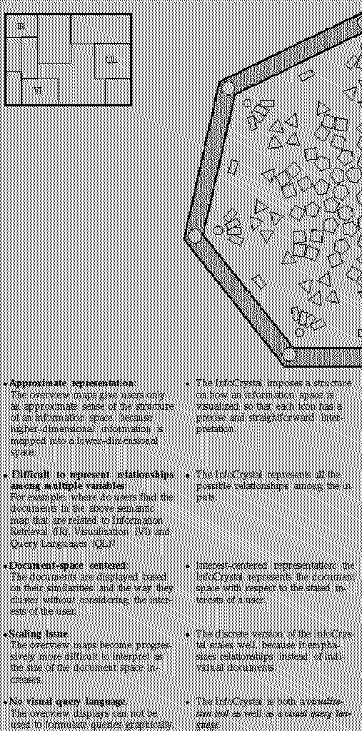
The clustering methods described above, except for Scatter/Gather, provide users with an overview map of the information or document space, where the documents are clustered based on some similarity measure. These efforts make a valuable contribution because users can use them as a starting point in the search process. As we will discuss in chapter 12, these map displays and their clustering techniques could be integrated with the InfoCrystal, where users could use them to help them identify the inputs that could be used to initialize the InfoCrystal. Further, these overview maps can facilitate information retrieval or database mining because they might reveal hidden regularities in the data that are hard to discover using individual queries. However, these overview have the following shortcomings, as summarized in the left-hand column, and in the right-hand column we indicate how the InfoCrystal addresses them :
10.2 Visualizing Hierarchical Structures
In this section we mention several approaches that address the problem of how large hierarchical structures such as file directories or corporate organizational structures could be visualized.
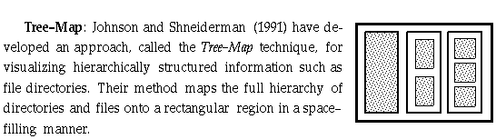
They make use of Venn diagrams to visualize directories and the files and
subdirectories they contain, and they use a "slice and dice" approach
to tessellate the rectangular region. This approach shares similarities with a
"Russian doll", with the difference that a larger doll can contain
more than one smaller doll.
· We can use this approach to visualize the hierarchical structure of a complex InfoCrystal query in compact and space efficient way. We plan to develop a tool, called query overview, that provides users with a quick insight into the query structure, thus making it possible for them to quickly locate an InfoCrystal that needs to be reprogrammed. Users can navigate through the structure by clicking on the rectangle representing the InfoCrystal of interest.
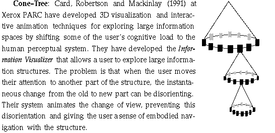
As part of the Information Visualizer, they have developed an
information visualization technique, called the Cone Tree, which is used
for visualizing hierarchical information structures. The hierarchy is presented
in 3D to increase effective use of the available screen space and to enable the
visualization of the whole structure. The top of the hierarchy is the apex of a
cone with its children placed evenly spaced along its base. The next layer of
nodes is drawn below the first, with their children in cones. When a node is
selected, the Cone-Tree rotates so that the selected node and each node
in the path from the selected node up to the top are brought to the front and
highlighted. The Visualizer presents as much contextual information as possible
and provides useful abstractions of the data and its structure. The 3D
perspective view of the Cone-Tree provides also a fisheye view of the
information. A selected object appears brighter, closer and larger that other
ones, both because of the 3D perspective view and because of coloring and
simulated lighting. Interactive animation is used to shift some of the user's
cognitive load to the human perceptual system. The animation allows the user to
track rotations, and when it is completed, no time is needed for
reassimilation, because the perceptual phenomena of object constancy.
· The Cone Tree representation could be used to visualize the hierarchical InfoCrystal query structures in a three-dimensional form. The work by Card, Robertson and Mackinlay at Xerox PARC demonstrates convincingly that interactive animation techniques are effective for accessing large information spaces, because they shift some of the user's cognitive load to the human perceptual system.
Fisheye View: This representation offers users an overview of a large information structure, where the elements that are currently of greatest importance are clearly visible and the less important ones do not clutter the display. The Fisheye representation uses both the distance from the current point of interest and the a priori importance to the users to display hierarchical structures [Furnas 1986]. This approach has been extended to the graphical display of graphs by adding a visual worth variable [Sarkar and Brown 1992].
· We plan to explore the use of a fisheye transformation to emphasize interior icons satisfying certain requirements and to de-emphasize the others. The Network InfoCrystal already possesses a fisheye effect (see section 3.6.2).
10.3 Familiar Metaphors for Accessing Information
In this section we describe several familiar metaphors that can be used to help users access large information spaces. We also describe a visual metaphor that can be used to communicate to users how the contents of individual documents are related to the users' interests.
House/Rooms/Objects Metaphor: Pejtersen et al. (1993) have developed a retrieval interface for Danish libraries by performing a work domain analysis and employing the familiar metaphor of a House/Rooms/Objects to communicate organization and possible attributes of the documents. The interface is designed to support recognition-based navigation and browsing for information. They provide a number of activity spaces to support different cognitive processes and tasks. A semantic network of the information sources in fictional literature has been designed to match the user's goals and motivations. A multifaceted classification scheme for representing the book content at several levels of abstraction that corresponds to user's ways of asking for information has been developed for indexing the books. This user-oriented indexing results in a very tight relationship between the representational structure of the book content/links and users' queries and categorization of information. The content and structure of the interface were designed to match users' cognitive and perceptual capabilities during shifts among several retrieval strategies.
The icons have been designed to match the user population's cultural background and knowledge (e.g., globe = geographic location, clock = time, etc.). Only icons whose meaning could be perceived by naive users within at most two seconds have been used (using multiple choice association tests). To support signs for actions, icons were chosen in the form of metaphors having functional/action analogies to a familiar context. For example, users communicate their reading needs by interacting with objects on work desk in a room, where these objects represent the various dimensions of the information need (specify the features of interest, where these features belong to different categories). The icons function as command icons which allow the specific dimensions to be specified by direct manipulation. They claim that the navigational metaphor (HOUSE -> ROOMS -> OBJECTS ...) is a very efficient support in providing users with an understanding of the structure of the hypermedia system.
In summary, Pejtersen et al. argue for information or hypermedia systems that support perception and action-based or recognition-based information processing. They propose that hypermedia interfaces should be based on an analysis of users' cognitive and perceptual characteristics. Semantic domain networks should be represented in interface displays as symbolic information referring to the semantic content of the nodes, but, at the same time, they should be represented as signs for action/link selection.

ments, using a non-hierarchical clustering algorithm, where the descriptive
keywords have been automatically extracted and are used to form a vector. They
use a standard vector space approach as well as a non-hierarchical clustering
algorithm to help users become more content and structure aware. Their method
creates a certain number of clusters that are visualized using the familiar
pile metaphor.
· We could offer an additional style for the interior icons to visualize the contents of the individual interior icons.
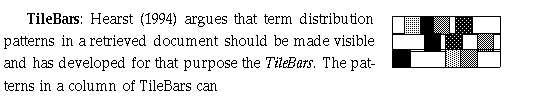
be quickly scanned and deciphered to help users make judgments about the
potential relevance of the retrieved documents. The bars for each set of query
terms are lined up vertically one next to the other. This produces a
representation that simultaneously and compactly indicates relative document
length, query term frequency, and term distribution across the identified
distinct text segments. Term overlap and term distribution are both easy to
compute and can be displayed in a manner in which both attributes together
create recognizable patterns.
Hearst (1994) makes the argument that methods that use a similarity measure to
determine the relevance of a document are appropriate for abstracts, because
most of the terms in an abstract are salient for retrieval purposes, because
they act as placeholders for multiple occurrences of those terms in the
original text, and because these terms tend to reflect to the key topics in the
text. However, it can be problematic to apply the similarity approach to
full-length text documents because their structure is quite different from that
of abstracts. Most long texts discuss several key topics simultaneously, hence
two texts with one shared key topic will differ in their other key topics. As
we have argued in chapter 5 and in Spoerri (1993), Hearst makes the point that
a ranked list obscures the role that the query terms played in the ranking of
the retrieved documents, whereas the goal should be to provide users with this
type information in a form to permit swift interpretation.
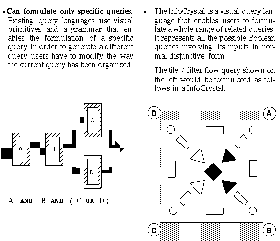
10.4 Visual Query Languages
Many of the problems that users face when formulating queries can be overcome by offering them visual interfaces, where the evidence suggests that graphical ways of specifying a query are preferable for most kinds of queries (Bell and Rowe 1990). Several retrieval systems have recently been developed that use graphical interfaces that support users in the browsing, selection and retrieval of information [Fox et al. 1993, Kahle et al. 1993]. These interfaces use traditional and standard graphical representations, such as forms-based interfaces with structured fields, associated sliders and radio buttons, ranked lists, tables or scatter plots, to help users formulate queries and view the results. These systems attempt to make all the options clearly visible and to supply the syntax for the queries. These systems have been developed using "user-centered" design principles and user studies to guide the creation of the respective interfaces. Although these interfaces represent a great step forward to help users access information, they do not propose very innovative visual interfaces. A goal of thesis has been to create a novel visual representation for accessing information that has been sufficiently mature and tested to warrant further work by a larger community of researchers to develop it further so that it will eventually become part of the mainstream of available visual metaphors.
In this section we mention several visual query languages that have been developed to help users to retrieve data from relational databases:
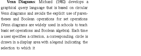
belongs. The user designates which elementary subsets to be selected by
pointing on the desired portion of the Venn diagram of the intersecting
circles. At most three criteria can be considered at the same time, because
more than three intersecting circles can not represent all possible
relationships between more than three criteria. To be able to create more
complicated queries the user must use a "Memorize" function that
causes the previous selected subsets to be represented by a single circle. This
new subset can be then combined with at most two more new criteria. Michard
conducted an experiment to compare this graphical query interface with a more
traditional design. The results showed that the Venn diagram representation
lead to less error-prone queries, where the statistically significant
difference was mainly due to parentheses misuses. We eliminated this source of
errors in our user studies by only accepting valid Boolean queries (see Chapter
8).
· The InfoCrystal moves beyond the Venn diagram approach so that more than three criteria can be represented at the same time. Further, the InfoCrystal is a more versatile and comprehensive interface than the one presented by Michard, because, for example, complex or weighted queries can be formulated more readily.
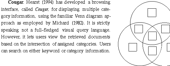
In Cougar, documents are assigned their three top-scoring categories from a
pre-determined set that has been constructed using an automatic categorization
algorithm. The documents are then indexed on the category information as well
as on all lexical items from the title and the text body. Users issue queries
by entering words or selecting categories from an available list. The most
frequently occurring categories in the retrieved documents are displayed in a
bank of color-coded buttons. The user can select up to three of these
categories and see how the documents intersect with respect to those
categories. Like the InfoCrystal, Cougar is designed to provide the needed
tools to enable users to browse multi-dimensional spaces, because multiple
categories or properties are associated with each document. The contribution of
Cougar is the way users receive assistance in the selection of the reference
points. However, its visual interface suffers from the same limitation as the
traditional Venn diagram approach. The InfoCrystal was designed precisely to
overcome this limitation so as to be able to visualize N and not just at most
three categories at the same time. Furthermore, the InfoCrystal can visualize
weighted and vector space queries.
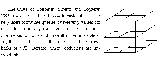
This approach suffers from the same limitation as the interface based on the
traditional Venn diagram approach because at most three concepts or dimensions
can be considered simultaneously.
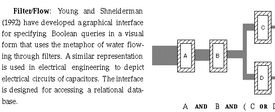
The flow is left to right and the logical AND is visualized by requiring that
the attribute menus are in same row but in a different column. The logical OR
is represented by requiring that the attribute menus are placed in same column
but in different rows. This interface is intended to alleviate some of the
difficulties users have in specifying Boolean queries and an experiment was
conducted to comparing the visual interface with a text-only SQL interface.
There was a statistically significant difference in performance favoring the
Filter/Flow interface, where the most frequent error type was the incorrect use
of parentheses.
Anick et al. (1991) have developed a similar interface, called tiles,
for specifying Boolean queries, where they use the vertical dimension to signal
an OR and the vertical to indicate the AND operator.
Existing visual query languages, including the ones mentioned above, suffer generally from the following limitation: