Summary | Audience | Task | Navigation | Functionality
Web Site Evaluation - Amazon - Functionality
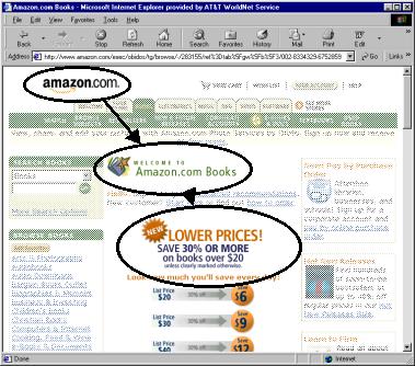
Instantly understand what the
site is about?
Shopping site - as shown below by the shopping cart symbol and the tab headings of the top row.

Understand what you can do
there?
Can shop for books, DVDs etc, which are organized into clear categories.
"Look & feel"
entice you to stay and explore?
No frills - straightforward. Users have several ways to "dive in" without wondering where it will lead them.
Functions most often used
easily accessible? Easy to use?
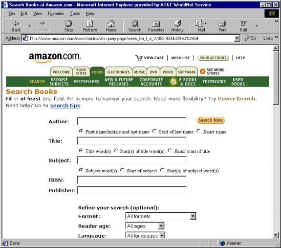
Yes. Search is located towards the
top of the page.
The breakdown into relevant categories is useful.
Also direct access to "Bestsellers" or "New Releases" as
well as "View Cart" and "Wish List".
Links clear about where they
will take you?
Each link uses or has associated text that spells out where it will take the user.
Instant visual hierarchy? Or
visually too busy?
The eye is clearly guided from
the "site-id" to "title page" to "value proposition":
you
can save money here.
Similar to the layouts used by news sites, the main content is in the center
column of the page.
The second row from the top is used for first level navigation.
The left most column is used for second or third level navigation.
The right most column is used for special announcements or shortcuts.
Text easy to read?
Use a "sans serif"
typeface that is easy to browse. Use bolding effectively to create visual
focus.
Textual icons use all capital letters, which is not always as easy to read.
However, words in all capitals are used sparingly and consistently for main
category headings.
Graphics easy to understand?
Limited use of icons and graphics - when used, clear and reinforced with textual description.
Large site has a site map,
index or search function?
Yes. Search is contextual - we are
in the book section, the search category is "books."
More advanced search features are available and organized in a common sense
way.
Help available and useful?
Yes.
Download times reasonable?
Yes.